Bioreactors - The heartbeat of Biopharmaceutical Manufacturing For many biopharmaceutical manufacturing companies, the bioreactor is…

Pictures tell a thousand words
What does “normal” look like when it comes to process equipment?
Troubleshooting process equipment is the core role of Process Engineers at a biopharmaceutical facility. Before you can identify a problem with the equipment, you need to know what “normal” looks like.
What is the normal pump output?
What is the normal tank level?
What is the normal speed of rotation of this agitator?
What is the normal temperature that this bioreactor runs at?
What is normal?
Process Trending & Simulation
The process trending and simulation tools by AspenTech are indispensable. Using Aspen Process Explorer, you can quickly chart any number of process equipment characteristics. Some of the trends most frequently pulled by Process Engineers include flow, pressure, temperature and speed. You can consider these parameters as baseline trends.
You can build displays of these trends that make sense to not only other engineers in your department, but to others outside of your immediate department. Color coding was essential, especially if you want to highlight a particular process parameter that is most critical.
The cool thing was whenever there is a process upset or power outage, your eyes will have already been trained to recognize what “normal” is.
With process trends, you can go back and forth to the “normal” time period to compare to the upset conditions time period.
Using Aspen Process Explorer will cut down your troubleshooting time significantly. Because you can quickly pinpoint which of the process trends was “off”, you can then take the next step to drill down into the root cause. The sooner you are able to identify the root cause, the sooner you can implement remediations or solutions that work the first time.
But as they say pictures tell a thousand words, right?
What is the importance of using process graphics?
Aspen Process Explorer has this cool feature that allows you to build graphics – essentially, “pictures”. If you can trend it, then you can build graphics for it.
Being able to build graphics, even simple ones, is a game changer. The process trends look like a “picture”.
You can now take this “picture” and present your root cause analysis to Management, to Quality Assurance, to Safety, and even to non-technical roles in Supply Chain and Sales.
It’s a “picture”.
Now, everyone can clearly see where the process upset was.
See! See that red valve on the top right there?
Well, that valve should actually be green (Figure 1).
Clearly, this valve should have been open during this step in the process, but it wasn’t and that’s why we had a failure.
See, everybody?
Yep, got it (heads nodding in agreement).
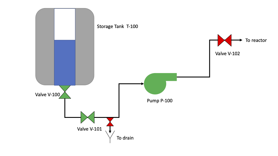
Figure 1: Process graphic example displaying storage tank, pump, valves and process lines. In this example, the red valve (top right) indicates it is closed, when it should have been open for this step in the process.
How to create Process Flow Diagrams?
In the blog, Connecting the dots with Process Flow Diagrams, you get more details on the different types of tools available to create Process Flow Diagrams (PFD).
When it comes to PFDs, don’t get stuck at a blank screen.
Use your core process knowledge to fill that screen with valves that change colors from green to red to tell you it was open or closed.
Add tank levels that turn red from blue when the level got below the target set point.
Add pump speeds that turn green at optimal speeds.
Add conductivity meters that started blinking when the target conductivity was not met at the end of a Cleaning in Place (CIP) cycle.
Telling a Story
With a well-detailed Process Flow Diagram in hand, you can now tell your story to many more people than just your core group. You can actually break down silos and empower your entire team to get to solutions faster.
—————-
To learn more about PFDs and how we can digitalize the equipment data that each component on your PFD represents, schedule a call with us today.
—————-
Repurposed and reprinted with permission.
Related Posts